Seiryu Pharmacy
Client: Seiryu Pharmacy
Project: Branding
Japanese pharmaceutical brand Seiryu wants to bring their uniquely Japanese pharmacy experience to the Philippine market. Seiryu is guided by their principle of Odaijini (Japanese for "take care/ get well soon") where their brand extends the idea of wellness beyond the transactional nature of pharmacies.
VCS helped Seiryu with brand development to bridge the intricacies of Japanese and Filipino cultures in order to create a brand identity, manifesto, and imagery that stays true to Seiryu Pharmacy's Japanese roots while warmly embracing the Filipino healthcare market.
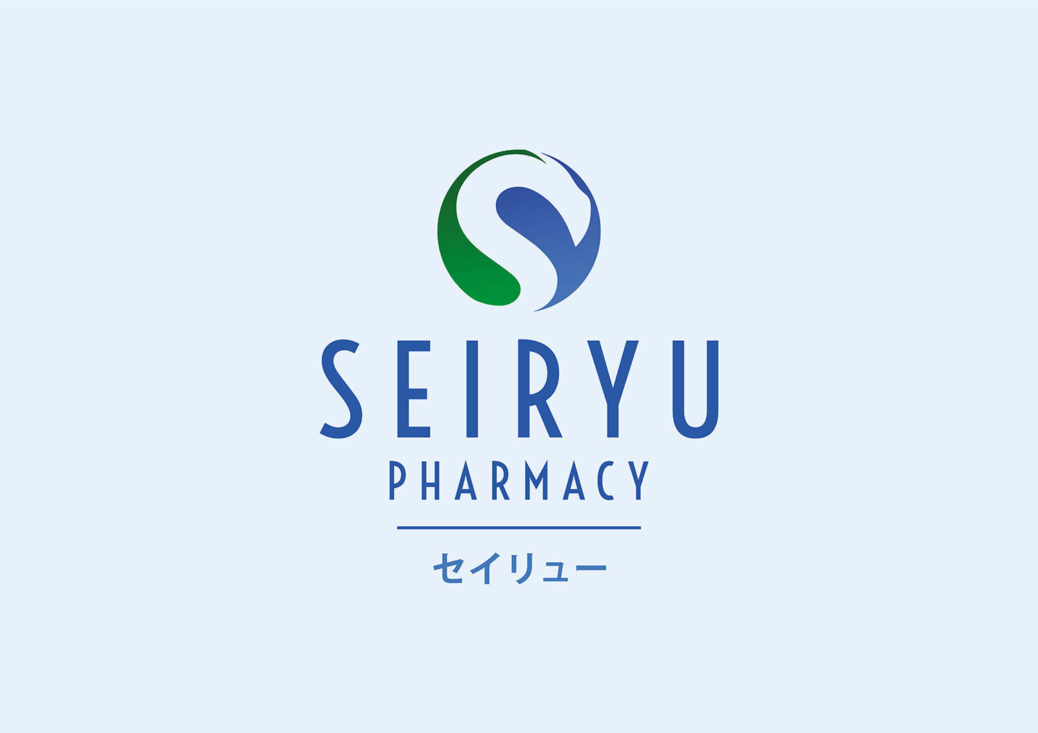
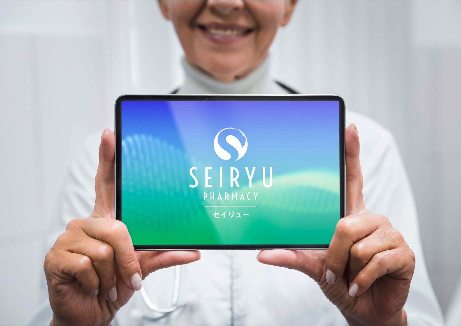
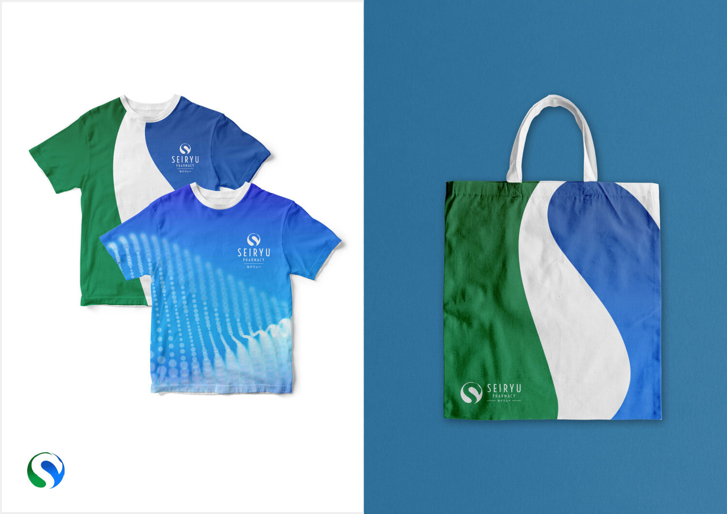
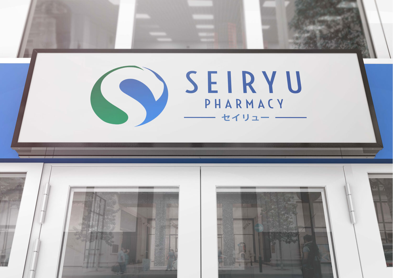
VCS poured creativity and care in designing Seiryu Pharmacy's logo as it serves as the most visible element of the brand's identity. The logo is Seiryu Pharmacy's universal signature across all communications and is a guarantee of the brand's product and services quality.
VCS created a logo which is clean and bold, reflecting Seiryu's professional pharmaceutical services. The logo is distinctive and legible, and is flexible enough to allow a full range of creative expression, both contemporary and classical.


YOU MAY ALSO LIKE